Exploring the dashboard
The dashboard is the default landing page in Kaseya MDR. It provides a high‑level, alert‑centric view of security activity across your environment, designed to help you quickly understand current conditions and decide where to focus investigation or response next, if any action is required.
The dashboard is intentionally not where investigations are performed or response actions are taken. Its role is situational awareness and triage, showing what may require attention and which areas of the platform to move into next. The dashboard helps you decide whether investigation is needed and where to begin, rather than reviewing alert context or taking response actions directly from the dashboard.
In addition to alert visibility, the dashboard brings together summary indicators and supporting panels that provide orientation into how Kaseya MDR is currently being used. As the platform evolves, this page may also surface high‑level updates and new capabilities.
By default, the dashboard opens to the Overview tab. The sections that follow describe the information surfaced in the Overview view unless otherwise noted.
Use this page to understand what the dashboard shows, how to read it, and when to move into alert review, investigation, or response workflows.
Reading the dashboard at a glance
When you open the dashboard, scan it to orient yourself before taking action. Pay attention to the following areas:
-
Coverage and alert representation: Are expected environments and data sources visible at a high level?
-
Recent alert activity: Have any new alerts appeared since your last review?
-
Alert trends: Are alert volume or patterns changing over time?
-
Supporting panels: Are there platform updates or informational notices to be aware of?
Each area answers a different question and helps you decide whether deeper investigation is required and where to go next.
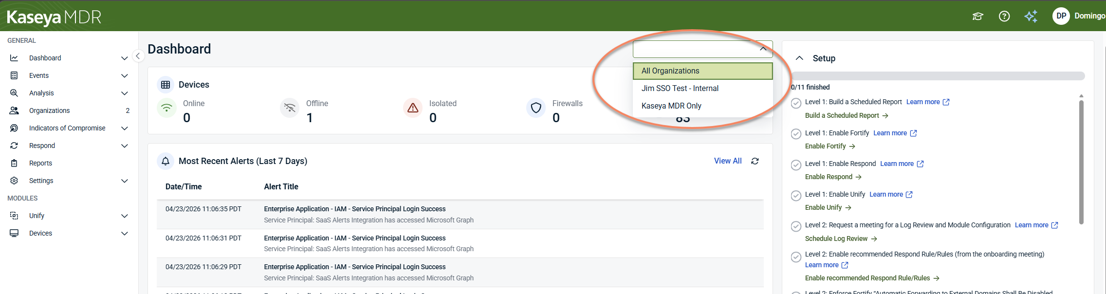
Organization context
At the top of the dashboard, you can select an organization to control which data is displayed. You can view data for all organizations or focus on a single organization, depending on your selection.
The dashboard updates to reflect the selected organization context. This selector changes what data is shown, but it does not perform actions or change configuration.
Alert‑centric design
Kaseya MDR is designed around alerts as the primary starting point for review and investigation decisions.
Alerts represent security conditions elevated for review based on correlated activity, rather than individual raw events. The alert‑centric design of the dashboard is reflected in several ways:
-
Recent alerts are displayed prominently as a continuously updated list.
-
Summary views focus on alerts and alert trends rather than raw event volume.
-
Visualizations highlight patterns over time instead of individual incidents.
This approach aligns the dashboard with day‑to‑day security operations, where the goal is to identify what may deserve investigation after alert review, not to analyze raw data directly.
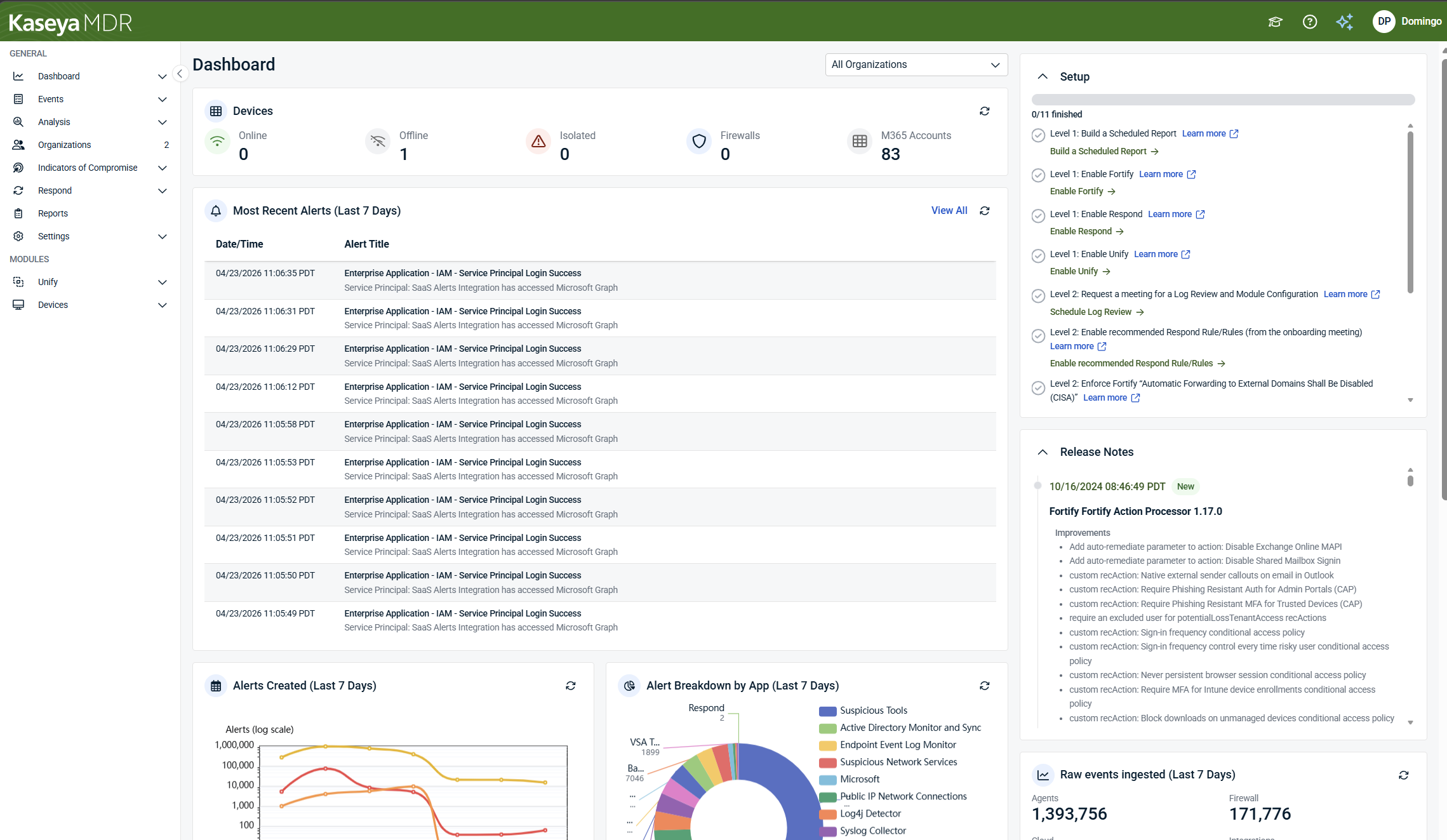
Top‑level summary indicators
At the top of the dashboard, summary indicators provide a snapshot of alert activity and high‑level representation across monitored environments. These indicators may include:
-
Devices: Monitored endpoints and infrastructure, including operational state such as online, offline, or isolated
-
Alerts: Overall alert volume over a given period
-
Firewalls: Monitored network devices generating alerts
-
SaaS or cloud accounts (for example, Microsoft 365 identities when integrated)
These values can help users reason about monitoring coverage and identify potential visibility gaps, such as offline devices.
Using these indicators
Use these indicators to answer high‑level questions such as:
-
Have there been notable changes since I last checked?
-
Are expected environments generally represented?
-
Is alert volume trending up or down?
These indicators help surface changes in visibility or activity patterns. They are not intended to validate ingestion completeness, data quality, or replace detailed health or status checks.
Most recent alerts
The Most recent alerts section displays a time‑ordered list of newly generated alerts across monitored environments.
For each alert, the list typically shows:
-
Date and time
-
Alert title, with supporting context or description
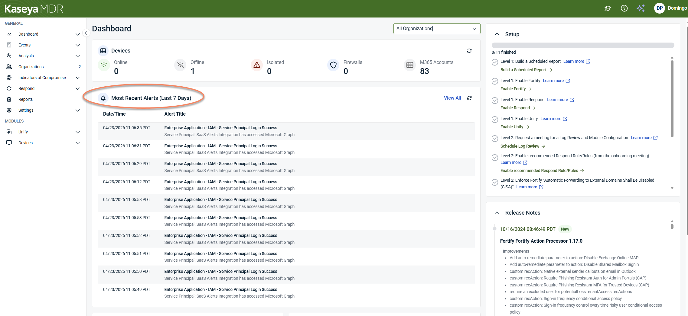
Why this section matters
This list is the primary entry point from the dashboard into alert review.
Use it to:
-
See what has changed recently
-
Identify new alerts that may require investigation
-
Decide whether an alert should be opened immediately or reviewed later
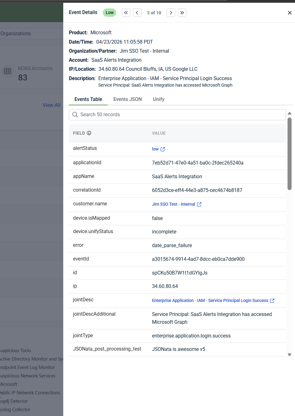
Selecting an alert takes you into alert details, where you review context and decide whether investigation is required. For more information on reviewing an alert, see Working with alerts.
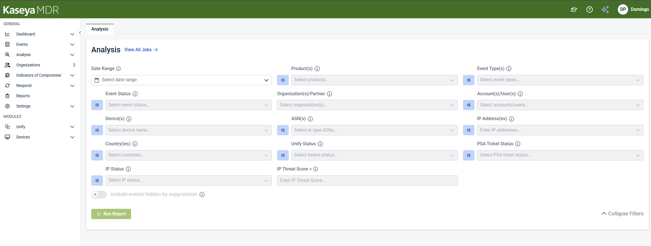
Selecting View All opens the Analysis page, where you can review additional recent alerts and continue investigation as needed.
Alert trends and visualizations
The dashboard includes charts that show alert patterns over time and distribution, rather than individual incidents.
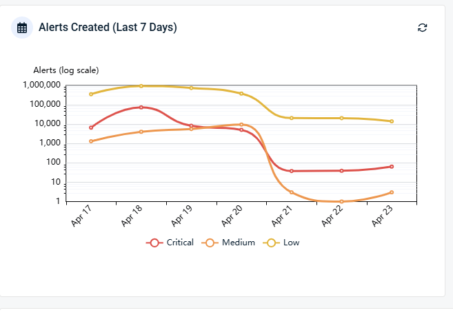
Alerts created over time
Trend charts show how alert volume changes over time by severity (Critical, Medium, Low). Use them to:
-
Identify increases or decreases in alert activity
-
Spot recurring operational patterns
-
Support internal reviews or reporting discussions
You can select or clear individual severity levels in the chart legend to show or hide those alert series, allowing you to focus on specific severities as needed.
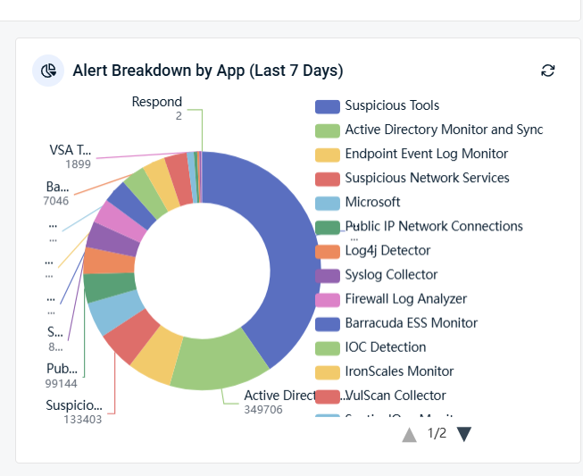
Alert breakdown by app
Alert distribution charts show how alerts are categorized by source or application. This helps you understand:
-
What types of activity are generating alerts
-
Whether alert patterns are shifting over time
Hovering over chart segments displays more detailed counts for each category. These visualizations provide context and trend awareness, not triage or response.
Supporting panels
The dashboard includes supplemental panels that provide additional orientation and shortcuts, such as:
-
Setup or onboarding links
-
Release notes or recent platform updates
-
High‑level ingestion, telemetry, or SOC‑reported activity indicators summarizing recent collection and processing volume
These panels are intended to provide awareness only and do not replace configuration, ingestion validation, or investigation workflows.
When onboarding or enablement is incomplete, a Setup panel may also appear to highlight remaining recommended actions or configuration steps, providing shortcuts to relevant areas without performing those actions directly.
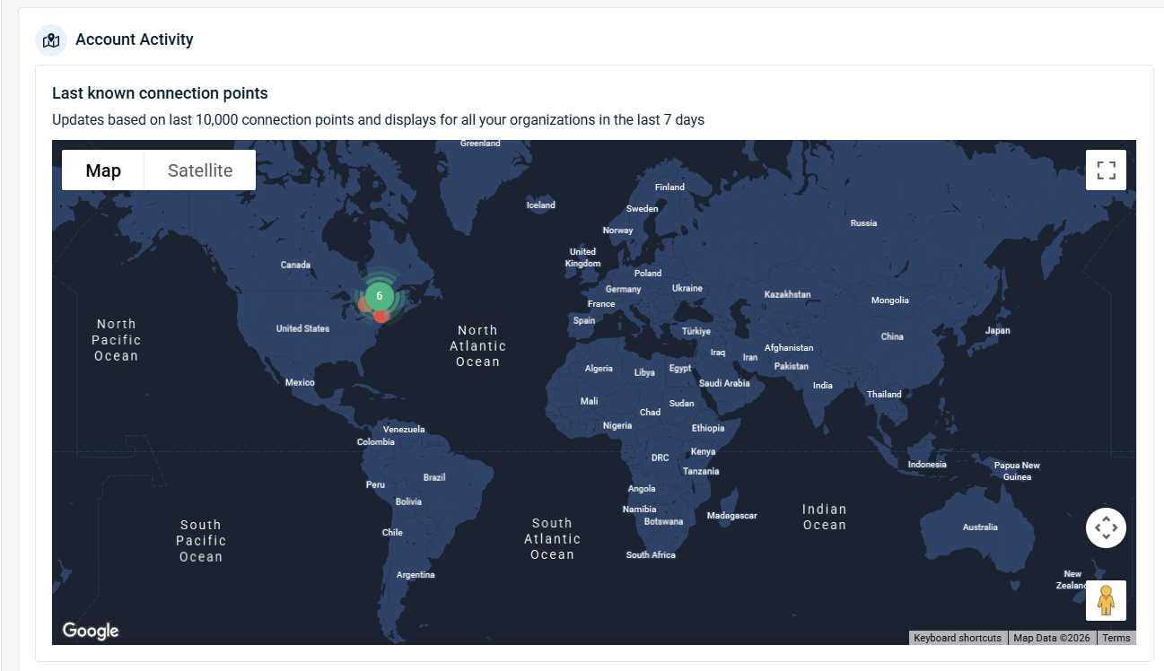
Account activity orientation
The dashboard includes an Account Activity view that visualizes last known connection points and geographic activity using a map‑based view. This view is intended for situational awareness only and helps identify broad activity patterns across organizations.
It does not replace alert investigation, identity review, or access analysis.
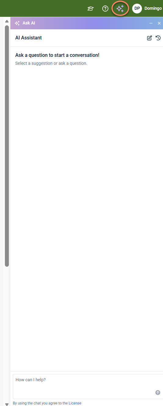
AI Assistant
The dashboard includes an AI Assistant that provides in‑product guidance and helps you ask questions about using the platform. The AI Assistant opens in a side panel and supports exploration, navigation, and understanding of features as you work in the interface.
When you open the AI Assistant for the first time, you are prompted to review and accept the applicable license or terms of use. Acceptance is required before starting a conversation.
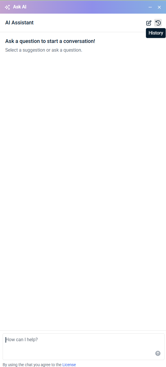
The AI Assistant is designed to assist with learning and guided understanding. It does not replace alert review, investigation, or response workflows, and it does not take actions on your behalf.
The AI Assistant includes a history option that lets you revisit previous conversations within the panel.
What the dashboard is—and is not
The dashboard is:
-
A summary of alert activity and high‑level representation
-
A way to spot changes since your last login
-
The starting point for alert review and investigation decisions
The dashboard is not:
-
A place to investigate alerts
-
A place to take response actions
-
A raw event viewer
-
A tuning or configuration interface
If something requires deeper review, the dashboard helps you identify it and then directs you elsewhere.
Additional dashboard tabs
In addition to the Overview tab, the dashboard includes other tabs that provide focused, high‑level views of activity. These tabs are intended for situational awareness and trend observation, not investigation or action.
Tickets
The Tickets tab provides a summary view of ticket activity associated with alerts, such as which organizations generate the most tickets in a given time period.
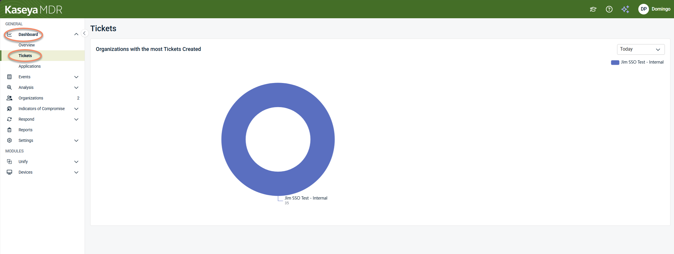
Use this tab to:
-
Understand ticket distribution at a high level
-
Identify trends in alert‑to‑ticket activity across organizations
This view is intended for awareness and reporting context only. Ticket review, workflow management, and remediation actions are handled outside the dashboard.
Applications
The Applications tab provides high‑level visibility into activity and alerts associated with monitored applications.
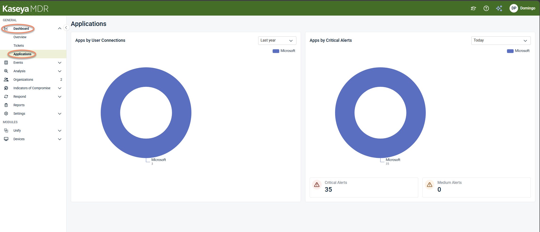
Charts in this tab can help you understand:
-
Which applications are most frequently involved in user activity
-
Which applications are associated with higher alert volume or severity over time
This view is useful for identifying broad patterns or concentration of activity across applications. It does not replace alert review, investigation, or application‑specific analysis.
Time range controls in dashboard tabs
Some dashboard tabs, such as Tickets and Applications, include a time range selector on individual charts. This control lets you adjust the period shown (for example, today, last month, or last year).
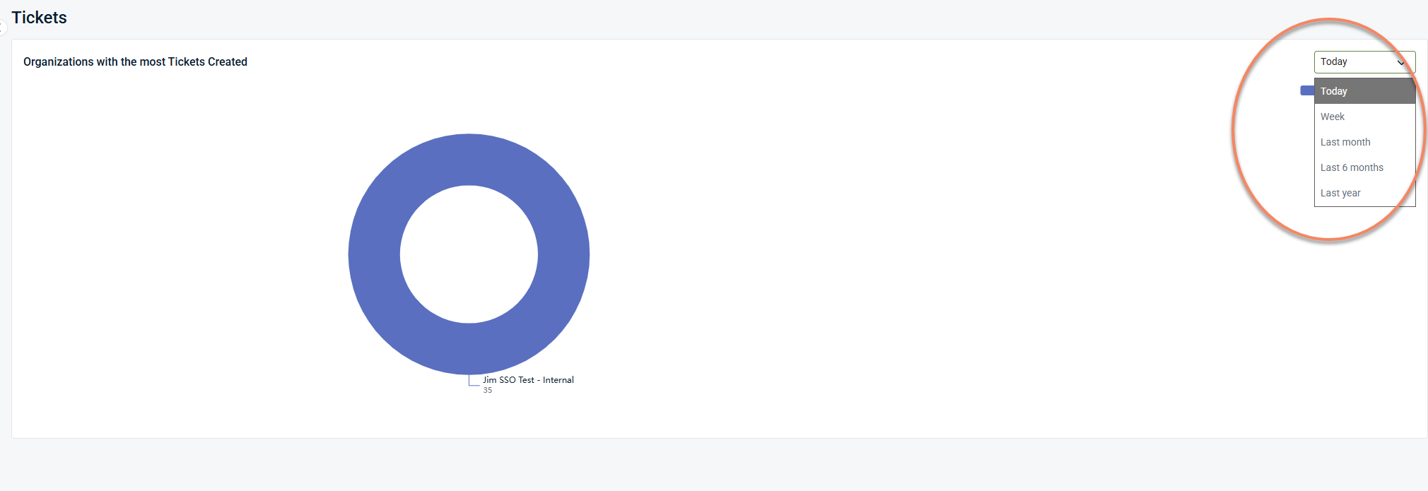
Changing the time range updates only the visualization where the control appears. It is used for trend comparison and contextual awareness and does not change alert review, investigation, or response workflows.
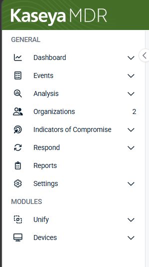
Navigation and moving beyond the dashboard
The side navigation menu is a persistent part of the Kaseya MDR interface and provides access to the main areas of the platform. While the dashboard is used for situational awareness and initial review, you use the side navigation to move into other areas—such as alert review, investigation, or response—as your analysis and decisions progress.
How the dashboard fits into daily workflows
Use the dashboard as part of this flow:
-
Exploring the dashboard: Understand current conditions and recent changes
-
Working with alerts: Review alerts and decide what requires investigation
-
Investigating alerts using the Analysis page: Validate context, scope, and impact
-
Managing noise and signal: Adjust future behavior after understanding patterns
Each step uses a different part of the platform for a different purpose.
Related articles
-
Working with alerts: Learn how to review alerts and decide what requires investigation
-
Investigating activity using the Analysis page: Perform deeper, correlated investigation when more context is needed


